

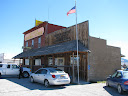


One of USPS's greatest assets lies in rural communities' connection to their small-town post offices. Such are not only places at which residents pick up their mail; they frequently serve as community gathering sites and, most importantly, marks of town identity and pride. Yes -- this means that in some parts of the country, people actually don't hate visiting the Post Office! The Postmaster of Muncie, Illinois, remarked to me one afternoon how the town of 200 had no grocery stores and no school, but ("golly") they had a post office! It's what defined them as a community.
It is the author's opinion that the removal of markings of local identity on such a community asset, in favor of those of a nationalized "brand" (akin to McDonald's), is wasteful and pointless. And frankly, it makes visiting these places a lot less enjoyable.
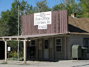
Below, generic post offices with new signage that do nothing toward promoting a sense of community identity. Or, as I like to refer to this segment of my post, "Let's play a round of 'Where the Heck is This?' ":


So: which do you prefer?
No comments:
Post a Comment